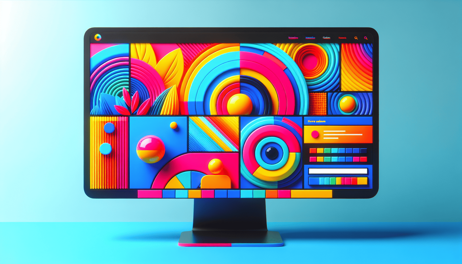
In the digital realm, where websites compete for attention amidst a sea of similarities, incorporating bold colors into web design has become a powerful way to capture users' attention and make a lasting impression. The strategic use of vibrant hues not only enhances aesthetic appeal but also plays a crucial role in shaping user experience and brand identity.
One of the primary reasons bold colors are effective in web design is their ability to immediately grab attention. In an age where users skim and scan content at lightning speed, establishing a strong visual hierarchy is crucial. Bold colors naturally draw the eye, directing users to key elements such as call-to-action buttons, headlines, or important messages. This intentional use of color can significantly improve conversion rates and engagement by guiding users’ focus and encouraging interaction.
Moreover, bold colors can evoke emotional responses, making them a potent tool for conveying brand personality. Different colors evoke different emotions and associations; for instance, red may evoke passion and urgency, while blue can convey trust and reliability. By choosing a color palette that aligns with a brand’s values and message, designers can create a memorable and relatable experience for users. A vibrant color scheme can distinguish a brand from its competitors, helping to establish a unique identity in a crowded market.
However, embracing bold colors in web design requires careful consideration and balance. Overuse or poor combination of colors can lead to visual clutter, causing confusion and detracting from the overall user experience. Successful implementation requires a thoughtful approach to color theory, including understanding complementary and contrasting colors and their potential psychological impact. Designers must ensure that their designs remain visually accessible to all users, considering color blindness and other visual impairments.
To effectively integrate bold colors into web design, start by selecting a primary color that aligns with the brand’s identity. Complement this with secondary colors that enhance and support the primary choice. The strategic use of white space can further amplify the impact of bold colors by providing visual breathing room and preventing a design from becoming overwhelming.
Using bold colors thoughtfully also involves testing and iteration. A/B testing different color schemes can offer valuable insights into user preferences and behaviors, allowing designers to optimize their approach. Additionally, seeking feedback from a diverse audience can ensure that the chosen colors resonate well across different demographics and cultural backgrounds.
In conclusion, bold colors in web design are more than just an aesthetic choice; they are a strategic tool for capturing attention, conveying brand personality, and enhancing user experience. When executed thoughtfully, bold colors can transform a website into a vibrant and memorable digital space that not only stands out but also communicates a brand’s values effectively. As competition in the digital landscape intensifies, leveraging the power of color can be the key to creating an impactful and enduring online presence.
